Bringing the University's website into the 21st Century

User research UX Design UI Design

Project info

Role
Web designer
Company
University of Wolverhampton
Duration
March 2014 - March 2015
Status
Launched 🚀

Overview

I'd been working at the University since January 2013 and during that time we as a digital marketing team had been pushing for a new website, the current one was old, on a technology hard to update and created anything new and dynamic for the site was either tedious or impossible depending on what you wanted to do. By the end of 2013 we had agreement to find a new Content Management System (CMS) to build the new website on.

After rounds of interviews, demos and due diligence with a number of different supplier the team from the university deciding on the tender, of which I was part of decided on our preferred supplier based on the scoring system in place.

The problem

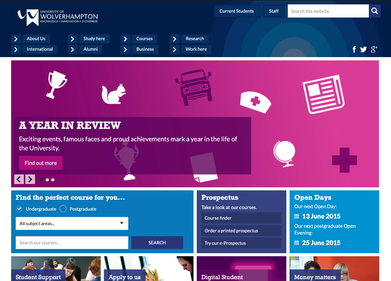
From there it was a case of building a modern, dynamic and responsive website that worked for both external and internal users.

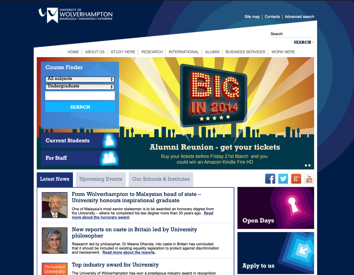
At this point in time the number of people accessing website via mobile devices was on an upward trajectory with the rough stats being 6% in 2011, 11% in 2012 and 16% by the end of 2013 with the projection of being closer to 50% within the next 5 years. The current website and CMS could not cater for this so it was time to start fresh.

Old site example

Opportunities

Opportunity 1

Starting from scratch we were able to influence the entire design

Opportunity 2

Navigation is key, making something that works

Opportunity 3

Identify what users need from the website and ensure they are considered at the forefront of the design

Opportunity 4

Time to content audit, with the existing page count so large, why migrate it all

Opportunity 5

Power search, put emphasis on the search to be as important as the navigation

Challenges

Challenge 1

Was relatively new for the team so needed to learn more around responsive design

Challenge 2

Stakeholders not receptive to change

Challenge 3

Getting hold of the users of the site, the university wasn't big into user research at this point in time so we had to come up with our own was of testing

Challenge 4

The previous site also had a password restricted internal intranet built of it too and this had to be replicated/redesigned within this project too

Challenge 5

Timeframe, we were give 12 months, which seems generous until you see size of the site to migrate

Challenge 6

10,000 existing pages to migrate between internal and external facing pages

Analysis

Competitor analysis

Before starting the design we looked a Universities websites that has recently been updated as well as some of the top universities in the country and around the world, from there we did an analysis of layout, structure, look and feel and layered that on top out our current structure to see where overlaps were and where we might be able to improve.

Statistic analysis

From there we were then able to use the Google Analytics we had for our current site to see the pages/sections with the heaviest traffic and identify them as the key areas to test with users on what works for them and what does, layered with time spent on page and drop out stats we came put with a list of pages we wanted to get user feedback on.

Key pages:

  • Homepage
  • Current students
  • Accommodation
  • Course finder
  • Staff homepage

The users

User group

At this point the university did not have great stats or information regarding their user base, to make this work we felt we need to gather this information to be able to create some personas around them, through initial research sessions around what people liked and didn't like about the current website we were able to come put with the following personas:

  • Current students (18+)
  • Mature students (25+)
  • Persepctive students
  • International students
  • Staff

Although these might seem quite rudimentary it was a good representative of what we could gather with the resources we had at the time. For example, getting information about perspective students was much harder that current students and we had to utilise open days and other events with perspective students to get that insight.

User needs

From this we were able to gather the following user needs for the website:

  • User need 1

    I want to be able to quickly find new content for current students

    Current students
  • User need 2

    Any university wide announcements should be clear and obvious

    All user groups
  • User need 3

    I want to be able to search for courses and see the requirements for it quickly

    Persepctive students
  • User need 5

    I need to be able to advertise messages to all staff

    Staff
  • User need 5

    I want to be able to find opportunities within the university

    Current students
  • User need 5

    I need to be able to find contact information quickly

    All user groups

Further exploration

Information architecture

One thing I hadn't had to consider previously in my design work was the information architecture around the site as well, as I'd only worked on smaller sites up until this point. Working alongside our colleagues in the IT Services team we identified a number of areas that could cause issue to the new site, in particular the site search and the course finder as both of them relied on the data being parsed correctly on the servers and returned to the user quickly which the servers were not set up for.

Luckily as part of the project we were able to show the difference between the experience with and without the improved architecture and the funding to improve it was granted.

Support model

Another key part of the project was getting the search functionality right, this relates to the support model as if this didn't work right the number of calls the university received would increase then increasing the load on the support teams.

We conducted research with the team to see where their highest traffic of calls was coming from and it was the course finder, as such this formed part of the experience change to the information architecture resulting in a much better search functionality of courses.

On top of this we redesigned the course pages from the ground up being able to give more information in a clearly structured format making the information easily to find on the website.

Finding the solution

Prototyping

Overview we spoke to 35 people aged between 17 and 55 across the 12 month period.

To start of with we used wireframes to look at the structure of the new site but decided to show more high-fidelity designs to users, this was done by mocking up the pages and using InVision to click through in a very rudimentary way.

Validating designs

We found a number of things didn't work well, especially the navigation on mobile, and particularly with current students who've used the current site, so we iterated them and re-tested over 5 different sessions to get to the final product.

Conclusions

Final design

Below is a snapshot of the final website after months of design and research to get it to this stage.

To draw conclusions I'm going to reflect on the opportunities and challenges identified earlier.

Opportunities

Opportunity 1

Starting from scratch we were able to influence the entire design

Reflection

This was key but also took up a lot of the time identifying the right platform to use before being able to understand what design constraints it might have.

Opportunity 2

Navigation is key, making something that works

Reflection

Initially a problem, after testing we were able to make this work for the users

Opportunity 3

Identify what users need from the website and ensure they are considered at the forefront of the design

Reflection

Having the time to research our users was something we'd not had the time/budget/luxury to do before this but it became key to the re-design.

Opportunity 4

Time to content audit, with the existing page count so large, why migrate it all

Reflection

Although all the pages got migrated in a bulk migration we were able to get each department to review and remove pages where necessary.

Opportunity 5

Power search, put emphasis on the search to be as important as the navigation

Reflection

Wasn't as 'easy' as first hoped but working with colleagues from other departments this was able to be realised.

Challenges

Challenge 1

Was relatively new for the team so needed to learn more around responsive design

Reflection

Was able to overcome this by attending courses on how to design for responsive websites and other courses to help improve my knowledge to bring back to the team.

Challenge 2

Stakeholders not receptive to change

Reflection

Initially an issue as we took the stakeholders on the journey with us it was easier to get them 'on-side' although there were some issues moving through eventually we were able to delivery a site that worked for the business and the user.

Challenge 3

Getting hold of the users of the site, the university wasn't big into user research at this point in time so we had to come up with our own was of testing

Reflection

This was challenging from a perspective student point of view but current students were very receptive to help working alongside the Students' Union there wasn't any trouble recruiting current students.

Getting staff involvement was a little harder but overtime different departments came on aboard when they were shown the benefits against the time it might take.

Challenge 4

The previous site also had a password restricted internal intranet built of it too and this had to be replicated/redesigned within this project too

Reflection

Added to the workload but was essentially managed my each department to make changes to their pages and we facilitated a redesign of the structure and homepage.

Challenge 5

Timeframe, we were give 12 months, which seems generous until you see size of the site to migrate

Reflection

Everything was tight for this deadline, especially with the tender process eating up 3 months of the process, although in that time the initial research was conducted too.

Challenge 6

10,000 existing pages to migrate between internal and external facing pages

Reflection

Handled by a bulk migrated that CMS provided helped facilitate.

Final thoughts

We launched on time and within budget but it did mean the site was 100% the way we wanted it. As with all projects hindsight is 20/20 and their are a number of things I'd have loved to have done differently but they may have required a higher budget and/or more time to develop the website.

Ultimately we were able to delivery what we were asked of by the business and it did meet the key user needs as well.

Feel free to get in touch, always happy to discuss new opportunities, work etc.

© Jonathan Gough  |  Images from Design Stripe